

> Editorial Note: I’m Olivia Bennett, a storage and organization contributor. I approach storage as a systems problem rather than a product one — fit to actual room dimensions, load ratings, and how the system holds up under daily use.
The mistake almost everyone makes: they style the shelf before they empty it. They add a vase here, a frame there, then wonder why it looks cluttered instead of curated. A styled bookshelf starts as a blank grid, not a shelf you decorate around what’s already there. Clear it completely first. Then build back with intent. If you’re still choosing the unit itself, start with best bookshelf and check the load rating before anything else. Pair the styling below with a real storage plan — best storage baskets for the overflow, best closet organizer system for what shouldn’t live on display at all, how to organize a small closet for tight rooms, and best hanging closet organizer when floor space is gone. Styling is the last 20%. The system underneath is the other 80%.
The Ground Rules Before You Start
Three non-negotiables. First, weight: most particleboard shelves are rated for 15–25 lbs per shelf, so books go low and objects go high, never the reverse. Second, breathing room — leave at least one-third of each shelf empty, because negative space is what separates styled from stuffed. Third, anchor the eye: your bookshelf needs one clear focal point per shelf, not five competing ones. Measure your unit’s shelf depth before buying decor. A standard shelf runs 10–12 inches deep, and a sculpture wider than that will crowd every book beside it.
Step 1: Empty It and Sort by Weight (the Anchor)
Take everything off. Every book, every frame, every trinket. This is the step people skip, and it’s why their shelves never look right. You can’t compose a scene inside clutter you’re working around.
Once it’s bare, sort your books into two piles: keepers you actually want visible, and everything else that goes into a basket or another room. Aim to cut what’s on display by roughly 40%. A full shelf reads as storage; a two-thirds-full shelf reads as styled.
Now weigh the room’s structure. Heavy hardcovers and anything over 5 lbs belong on the bottom two shelves — that’s where the unit is strongest and where a low center of gravity keeps a 72-inch bookcase from tipping. Lighter paperbacks and decorative objects move up. If your unit isn’t anchored to the wall, do that now with an anti-tip strap rated for the shelf’s total load; Apartment Therapy flags tip-overs as the single most common bookcase hazard in homes with kids or pets. Leave the middle two shelves — the ones at eye level, roughly 40–60 inches off the floor, the most open. That’s your prime real estate. Don’t fill it yet.
Step 2: Stack Books Two Ways. Vertical and Horizontal
Here’s the trick that instantly makes a shelf look designed instead of packed: mix vertical rows with horizontal stacks. All-vertical reads like a library return cart. All-horizontal collapses into mush. You want both, alternating shelf to shelf.
On each shelf, run a vertical row of books along one side, 6 to 10 spines, no more. Then stack 3 to 5 books flat beside them, horizontally, to create a small pedestal. That horizontal stack does double duty: it breaks the rigid line, and it gives you a 4-to-6-inch platform to set an object on top. Height variation is the whole game.
Keep stacks under 8 inches tall so they don’t crowd the shelf above. Standard shelf clearance is 12–14 inches, and you want at least a few inches of air over every stack. Turn a few spines inward if the colors clash, a wall of loud paperback covers fights everything you place in front of it. Neutral spine tones let your decor read as the focal point. That’s the point.
Step 3: Add Objects in Odd-Numbered Groups
Now the decorative layer. The rule interior stylists live by: group in odds, not evens. Three objects, five objects, never two or four. Odd groupings feel intentional; even ones feel like bookends waiting for a set. Wirecutter’s home editors call this the fastest fix for a shelf that “looks off” without an obvious reason.
Each grouping needs three heights and three textures. A tall object, a medium one, a low one, a 9-inch vase, a 5-inch sculpture, a stacked pair of books topped with a small dish. Vary the material too: something matte, something with a sheen, something organic. That contrast is what your eye reads as “styled.”
Give each object a 2-to-3-inch buffer from its neighbors. Crowded objects blur together; spaced ones each get their own moment. Don’t line everything up at the shelf’s front edge, either, pull some pieces back an inch or two so the arrangement has depth front-to-back, not just a flat row. And leave one shelf almost empty on purpose. A single sculpture on an otherwise bare 30-inch shelf carries more weight than five objects fighting for the same span.
Step 4: Balance Color and Repeat It
The last move ties everything together: distribute your accent color so the eye travels across the whole unit instead of snagging in one corner. Pick one dominant tone, a warm brass, a sage green, a matte black, and place it three times, spread diagonally across the shelves. Three points of the same color, roughly 24 to 30 inches apart, create a rhythm that reads as cohesive rather than random.
Everything else stays quiet. A styled bookshelf runs about 70% neutral, 30% color and metallic. Flip that ratio and it turns loud fast.
Step back 8 to 10 feet, the distance you’ll actually view it from, and check the balance. If one side feels heavy, move a stack, don’t add more. The urge to keep adding is what killed the shelf the first time. Trust the empty space. It’s doing work you can’t see.
The Right Products Make It Easier
The pieces below are the height-and-texture variers that anchor Step 3, each one clears a 4.7 owner rating and stays under the 10-to-12-inch shelf depth so it won’t crowd your books. Start with a single sculptural piece per shelf, not a set on every one.

Lynagert Small Heart Hands Sculpture Gold Resin Love Statue Decor for Living Room Bookshelf Coffee Table Gift
Pros
- Strong 4.7-star rating across over 1,300 reviews signals consistent buyer satisfaction
- Resin material is smooth, lightweight, and holds detail well for the price
- Versatile enough to work as decor or a functional jewelry holder
- Gift-ready packaging removes the need for extra wrapping
Cons
- Small scale may read as underwhelming on large shelves or wide console tables without pairing with other objects
- Resin construction at this price point will not have the weight or finish of ceramic or metal alternatives
- Gold color options are limited, so buyers needing a specific metallic shade may need to check availability carefully
There is something genuinely charming about a piece this small making such a clear statement. The Lynagert heart hands sculpture does one thing well: it puts a little warmth on whatever surface you set it on. The gold finish is understated rather than flashy, which means it works alongside candles, books, plants, or trays without competing for attention.
In a real room it reads as a curated, intentional touch rather than clutter. On a bookshelf it fills a corner without blocking sight lines. On a bedside table it gives the space a personal, romantic feel. The bracelet-holder function is a genuinely useful bonus that keeps it from feeling purely decorative.
If you want a meaningful, gift-ready accent that adds personality to a small space without spending much or committing to a bold decor statement, this one delivers.
Styles it works with: Modern Minimalist, Contemporary Glam, Romantic Maximalist, Transitional
Best placed in: Bedroom nightstand or dresser top, living room bookshelf or floating shelf, home office desk corner
May not suit: Rustic or farmhouse interiors where warm gold tones can feel out of place, and very large open shelving units where a piece this small gets visually lost without additional styling around it
Buy it if:
- You need a quick, affordable gift for a birthday, anniversary, or Valentine's Day that arrives in presentation-ready packaging
- You are styling a bookshelf, desk, or nightstand and want a small love-themed accent to fill a gap without overpowering other pieces
- You want a jewelry or bracelet holder that also functions as decor on a dresser or vanity
Consider waiting if:
- You are hoping for a silver or rose gold version and want to confirm current color availability before ordering
Skip it if:
- You need a statement piece with visual weight for a large console table or mantel, as the compact dimensions will not carry a bigger space on their own
- You strongly prefer ceramic or metal materials and the texture and heft of resin does not meet your quality expectations
Check the latest price and availability on Amazon before it sells out.

Abstract Thinker Reading Sculpture - Resin Bookshelf Decor, Sandstone Finish, 4.53" Modern Art Statue for Desk & Home
Pros
- Highly rated at 4.7 stars across 107 reviews, indicating consistent buyer satisfaction
- Compact size fits spaces where larger sculptures would overwhelm the area
- Sandstone-style finish gives it a more expensive, handcrafted look than typical resin pieces
- Available in multiple color options (beige, gold, white) to match different room aesthetics
- Sturdy enough to stay put on shelves without tipping
Cons
- At 4.53 inches tall, it may look too small on large mantels or wide-open shelving units
- Limited to one pose and style, so it may feel repetitive if you buy multiples for the same room
- No weighted base, so it could shift easily if bumped on a high-traffic desk
There is something quietly charming about this little reading figure. It is not loud or attention-grabbing, but every time you glance at your bookshelf, it catches your eye and makes the whole arrangement feel more intentional. The sandstone texture gives it a warmth that plain glossy resin pieces just do not have.
In a real room, it reads as a collected, curated accent rather than something mass-produced. It pairs beautifully next to a stack of books, a small plant, or a candle. The neutral beige tone means you do not have to rethink your existing palette to make it work.
If you want a sculptural accent that adds personality to a small space without spending more than ten dollars or clutering your shelf, this one delivers.
Styles it works with: Scandinavian, Minimalist, Modern Coastal, Japandi
Best placed in: Bookshelf among stacked books, office desk beside a monitor, coffee table vignette with candles or a tray
May not suit: Very bold or maximalist spaces where its small size and neutral tone could get visually lost; large open mantels or wide floating shelves that need a taller statement piece
Buy it if:
- You need a finishing touch for a bookshelf or desk vignette and want something meaningful rather than generic
- You are shopping for a small, thoughtful gift for a reader, teacher, or book-loving friend
- You prefer neutral, understated decor accents over bold or colorful statement pieces
Consider waiting if:
- You want a larger sculpture (5 inches or taller) to anchor a bigger display area
Skip it if:
- You need a statement piece for a mantel or entryway table where something under 5 inches will look too small
- You prefer highly detailed, realistic figurines over abstract minimalist designs
Check the latest price and availability on Amazon before it sells out.
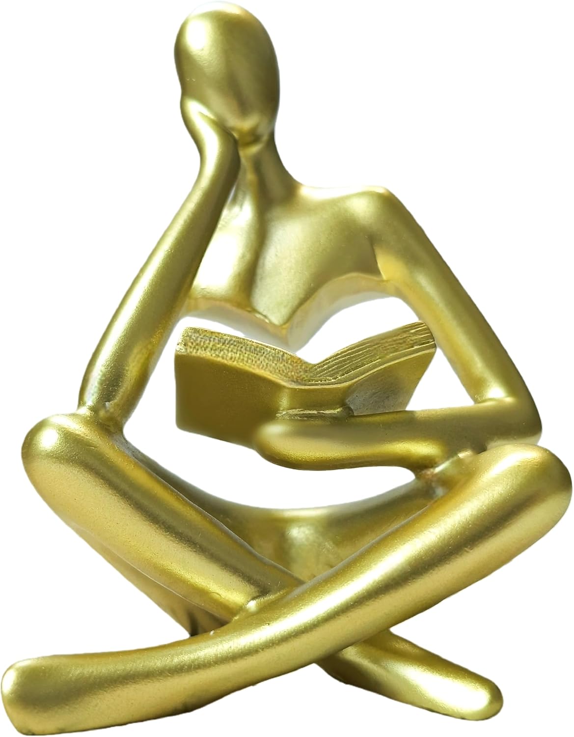
Gold Reading Woman Statue 4.5" Thinker Sculpture for Bookshelf Decor, Modern Home Accent & Book Lover Gift
Pros
- High-density resin feels solid and durable for the price
- Matte gold finish looks more expensive than its $7 price suggests
- Compact enough to fit almost anywhere without overwhelming surrounding decor
- Versatile styling works in offices, living rooms, and bedrooms
- Backed by a lifetime satisfaction guarantee with hassle-free returns
Cons
- Only 4.5 inches tall, which may look too small on larger bookshelves or mantels
- Limited to gold color with no alternative finish options currently available
- Resin material lacks the weight and coolness of ceramic or metal sculptures
There is something quietly charming about a tiny gold figure lost in a book. This reading woman statue from Goodluckstartsnow captures that feeling in a compact, well-finished piece that punches above its price point. The matte gold resin has a surprisingly refined look, especially when paired with neutral-toned books or a clean white shelf.
In a real room, it works as one of those small details guests notice and comment on. It does not demand attention, but it rewards it. Place it beside a stack of your favorite novels or tuck it into a curated shelf arrangement and it pulls the whole vignette together with a literary, personal touch.
If you want an affordable way to add personality to a bookshelf without committing to a large statement piece, this one delivers.
Styles it works with: Modern Minimalist, Glam, Transitional, Scandinavian with warm accents
Best placed in: Bookshelf among stacked books, home office desk, living room coffee table, bedroom nightstand
May not suit: Large open shelving units where the 4.5-inch height may get visually lost, or heavily rustic or industrial spaces where gold resin can feel out of place
Buy it if:
- You need a small, affordable accent to fill a gap on a bookshelf or desk
- You are putting together a gold-themed decor arrangement and want a literary focal piece
- You are shopping for a quick, thoughtful gift for a book lover, teacher, or college grad
Consider waiting if:
- You prefer a larger statement sculpture (this is only 4.5 inches tall)
Skip it if:
- You need a weighty, museum-quality figurine in metal or ceramic
- Your shelves are deep or tall and you need decor above 6 inches to be visible
Check the latest price and availability on Amazon before it sells out.
The Lynagert heart-hands sculpture is your low-height object, the piece that sits on top of a horizontal book stack from Step 2 without overpowering it. At a small footprint it fits the 2-to-3-inch buffer rule easily, so you can tuck it into a group of three and still leave breathing room. Its matte finish reads as the “organic, non-shiny” texture in a three-material grouping. Use it on the eye-level shelf where detail actually registers, not up high where the shape flattens out.
The RHXRAF abstract Thinker statue works as your medium-height anchor, the middle beat in the tall-medium-low sequence Step 3 calls for. Resin keeps it light enough for an upper shelf without stressing the 15-to-25-lb rating, and the sculptural silhouette gives the eye somewhere to land. Set it slightly back from the front edge to build the front-to-back depth that flat rows miss. One per unit is plenty, it’s a focal point, not a repeater.
The Goodluckstartsnow gold reading-woman statue is your color-repeat piece from Step 4. Its gold finish is the accent tone you place three times across the shelves, so buy it knowing it sets the metallic thread the rest of the arrangement echoes. The reading pose earns its spot on a bookshelf specifically, it’s thematic without being literal. Position it diagonally opposite another warm-metal object so the color travels instead of clustering.
Frequently Asked Questions
What if my bookshelf is really narrow?
Go vertical and keep depth shallow. On a shelf under 8 inches deep, skip horizontal book stacks, they’ll overhang the edge. Use slim vertical rows and pick decor with a small footprint, nothing wider than the shelf minus a 1-inch margin. One object per shelf, not groupings. Narrow units read best with restraint.
What if I have way too many books to cut down?
Then your shelf is storage, not styling, and that’s a real distinction. Keep 60% of the shelf as functional book rows and style only the top two and bottom shelf. Move overflow into baskets on the lowest shelf, a 13-inch bin hides 20-plus paperbacks while reading as intentional. You don’t have to choose between full and styled if you zone it.
What if my shelves are adjustable, where should I set them?
Vary the heights deliberately. Set two or three shelves at 12 inches for standard books, then leave one taller opening at 15 to 16 inches for a large sculpture or a stacked display. Uniform spacing looks institutional. Uneven, purposeful gaps signal that a person composed this, which is exactly the look you’re after.
What if everything still looks cluttered after styling?
You added too much. Remove one-third of what’s on the shelf and stop. The empty-space rule isn’t optional, aim for one-third of every shelf staying bare. Cluttered almost always means over-filled, not badly arranged. Pull pieces off before you rearrange the ones that remain. Less fixes it faster than more.
What if my bookshelf is in a high-traffic hallway?
Anchor everything and lower the risk. Objects over 5 inches tall get placed toward the back of the shelf, away from the front edge where a passing shoulder catches them. Use museum putty under lightweight pieces. In a corridor under 42 inches wide, keep decor flush and flat, projecting sculptures become obstacles you’ll knock every week.
Bottom Line
Empty the shelf first, that single move fixes more styling problems than any product you can buy, because you can’t compose inside clutter you’re working around. Build back to two-thirds full, group objects in odd numbers at three heights, and repeat one accent color three times across the unit. The main exception is a working book collection: if the shelf is genuinely storage, zone it, style the top and bottom, and let the middle do its job. Restraint reads as expensive. Empty space is the look.




Write Your Review
No reviews yet. Be the first to share your experience!