

> Editorial Note: I’m Hannah Lin, an Interior Living Researcher who’s spent 9+ years analyzing the home furniture market. This guide draws on BIFMA, GREENGUARD, and FSC certifications, plus owner reviews aggregated from Wirecutter, Apartment Therapy, and the major home design subreddits.
The biggest mistake people make with a bookshelf is filling it before they’ve emptied it. They stack every book spine-out, wedge in a few frames, and wonder why the whole thing reads as clutter instead of a styled shelf. Start with a blank shelf and a plan, not a pile. If you’re building a broader wall moment, the same restraint applies to your best gallery wall frames, your best console table for entryway, your best large floor mirror, your best wall mirror for living room, and even your best table lamp for living room. Nail the shelf first and the rest of the room follows.
The Ground Rules Before You Start
Three non-negotiables. First, measure your shelf depth. Anything under 10 inches limits you to books and slim objects, so don’t buy a 6-inch-deep sculpture for an 8-inch shelf. Second, leave breathing room. Aim for at least 2 to 3 inches of empty space above stacked books so the eye can rest. Third, work in odd numbers. Groupings of three or five read as intentional; pairs and fours feel stiff. Clear everything off before you place a single object back.
Step 1: Empty It and Sort by Weight
Pull everything off. Every book, frame, and trinket goes on the floor or a table where you can see it. This is the step people skip, and it’s why most shelves look accidental. Sort the pile into three groups: heavy anchors (large hardcovers, stacked books, dense sculptures), mid-weight objects (frames, small vases, boxes), and light accents (candles, small figures, greenery).
Heavy anchors belong on the bottom third of the unit. A tall bookcase carries most of its visual and literal load low, which matters for stability too. The BIFMA X5.6 stability standard exists because top-heavy shelving tips, so keep dense items on lower shelves, especially if you have kids or pets. If your bookcase is FSC-certified solid wood, you have more load tolerance than a laminate flat-pack rated for roughly 20 to 30 pounds per shelf. Know your number before you stack. Sorting first means you’re placing with a plan, not improvising object by object.
Step 2: Build the Book Foundation First
Books go in before anything decorative. They’re your foundation, and they set the rhythm for everything else. Split your books into two orientations: vertical rows and horizontal stacks. A shelf that’s all vertical looks like a library return cart. A shelf that’s all horizontal looks like a moving box. You want both.
For each shelf, try roughly a 70/30 split, about two-thirds vertical books and one-third horizontal stacks. Keep vertical books flush to the back or front edge, not floating in the middle. Cap a horizontal stack at 4 to 6 books, around 5 to 7 inches tall, so it reads as a platform rather than a tower. Those horizontal stacks do double duty: they become pedestals for a small object on top. Color-sorting is optional and polarizing. Apartment Therapy readers are split roughly down the middle on rainbow shelves, so do what suits your eye. What matters more is leaving that 2 to 3 inch gap of negative space on at least half your shelves.
Step 3: Layer in Objects Using the Triangle Rule
Now the decorative pieces. The technique that separates styled shelves from cluttered ones is the triangle. Place objects so your eye can trace a triangle across the unit, one tall element high on the left, a mid-height piece low center, a grouping high on the right. This keeps the whole bookcase balanced without being symmetrical.
Vary three things in every grouping: height, texture, and finish. A glossy ceramic next to a matte resin sculpture next to a woven basket gives contrast that a shelf of matching frames never will. Keep the tallest object under about two-thirds of the shelf’s clear height so nothing looks jammed against the shelf above. GREENGUARD-certified decor is worth prioritizing here since these pieces sit at eye level in living spaces where low-emission materials matter. Objects should overlap slightly front-to-back, never sit in a flat single-file line. Depth is what makes a shelf feel collected instead of staged. Step back after every shelf. Squint. If one spot pulls your eye too hard, thin it out.
Step 4: Edit, Add Life, and Leave Gaps
The final pass is subtraction, not addition. Walk away for an hour, then come back and remove 20 to 30 percent of what you added. Almost every over-styled shelf is one or two objects past its sweet spot. Empty space is a design element, not a failure.
Add one living or organic element per two to three shelves: a trailing pothos, a stem in a bud vase, or dried grasses about 12 to 18 inches tall. Greenery softens the hard geometry of books and boxes. Finish with a personal object on each visible shelf, something with a story, so the unit reads as yours and not a showroom. Check your sightlines from where you actually sit. That’s the whole edit.
The Right Products Make It Easier
The hardest step is layering objects with real height and texture variation, which is where a sculptural piece earns its shelf space. All three picks below clear a 4.7 owner rating and work as the mid-height or accent element in your triangle. Start with the first if you want a conversation piece; reach for the reading-themed statues if your shelf leans literary.
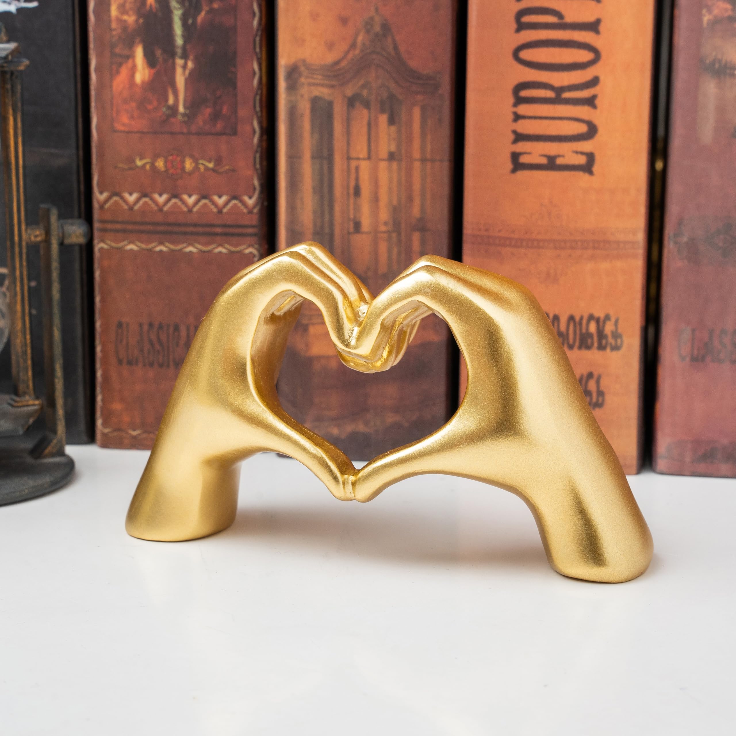

Pros
- Small footprint makes it ideal for apartments and dorm rooms
- Dual purpose as jewelry storage keeps bracelets organized and visible
- Affordable price point under $10 for trying out the aesthetic
- Easy to clean resin surface resists dust buildup
- Comes gift-ready in a box for last-minute presents
Cons
- No customer reviews yet to confirm quality and durability claims
- Gold color may not match if you have rose gold or silver accents throughout the room
- Small size could get lost on large coffee tables or empty mantels
This little sculpture does something smart: it gives you a romantic accent piece without screaming "couple's decor." The hand gesture reads as modern art first, love symbol second, so it fits into minimalist spaces and shared living rooms where overly sweet decor feels out of place.
What sets it apart is the bracelet holder function. Instead of letting your favorite pieces sit in a dish, you can drape them over the hands and turn everyday jewelry into part of the display. It's the kind of small detail that makes a bookshelf feel more curated without requiring effort every time you come home.
If you want a subtle romantic touch that actually holds things and works in small spaces, this one delivers.
Styles it works with: Modern Minimalist, Contemporary, Scandinavian, Glam
Best placed in: Bedroom nightstand, home office desk, bathroom counter as a ring holder, bookshelf styled with other small objects
May not suit: Large open shelving units where the small size gets visually lost, homes with toddlers who grab small decorative items, spaces decorated entirely in silver or rose gold tones
Buy it if:
- You need a small accent piece for a crowded nightstand, desk, or bookshelf under 5 inches
- You want a bracelet or ring holder that looks intentional instead of utilitarian
- You're furnishing a dorm, apartment, or starter home on a tight budget and want touches of personality
Consider waiting if:
- You prefer to see customer photos and reviews before buying decor items online
- You need something in a different metallic finish like rose gold or bronze to match existing accents
Skip it if:
- You need a statement piece for a large mantel, console table, or empty wall where this size will disappear
- You dislike figurative or representational decor and prefer abstract shapes
Check the latest price and availability on Amazon before it sells out.

Abstract Thinker Reading Sculpture - Resin Bookshelf Decor, Sandstone Finish, 4.53" Modern Art Statue for Desk & Home
Pros
- Highly rated at 4.7 stars across 107 reviews, indicating consistent buyer satisfaction
- Compact size fits spaces where larger sculptures would overwhelm the area
- Sandstone-style finish gives it a more expensive, handcrafted look than typical resin pieces
- Available in multiple color options (beige, gold, white) to match different room aesthetics
- Sturdy enough to stay put on shelves without tipping
Cons
- At 4.53 inches tall, it may look too small on large mantels or wide-open shelving units
- Limited to one pose and style, so it may feel repetitive if you buy multiples for the same room
- No weighted base, so it could shift easily if bumped on a high-traffic desk
There is something quietly charming about this little reading figure. It is not loud or attention-grabbing, but every time you glance at your bookshelf, it catches your eye and makes the whole arrangement feel more intentional. The sandstone texture gives it a warmth that plain glossy resin pieces just do not have.
In a real room, it reads as a collected, curated accent rather than something mass-produced. It pairs beautifully next to a stack of books, a small plant, or a candle. The neutral beige tone means you do not have to rethink your existing palette to make it work.
If you want a sculptural accent that adds personality to a small space without spending more than ten dollars or clutering your shelf, this one delivers.
Styles it works with: Scandinavian, Minimalist, Modern Coastal, Japandi
Best placed in: Bookshelf among stacked books, office desk beside a monitor, coffee table vignette with candles or a tray
May not suit: Very bold or maximalist spaces where its small size and neutral tone could get visually lost; large open mantels or wide floating shelves that need a taller statement piece
Buy it if:
- You need a finishing touch for a bookshelf or desk vignette and want something meaningful rather than generic
- You are shopping for a small, thoughtful gift for a reader, teacher, or book-loving friend
- You prefer neutral, understated decor accents over bold or colorful statement pieces
Consider waiting if:
- You want a larger sculpture (5 inches or taller) to anchor a bigger display area
Skip it if:
- You need a statement piece for a mantel or entryway table where something under 5 inches will look too small
- You prefer highly detailed, realistic figurines over abstract minimalist designs
Check the latest price and availability on Amazon before it sells out.
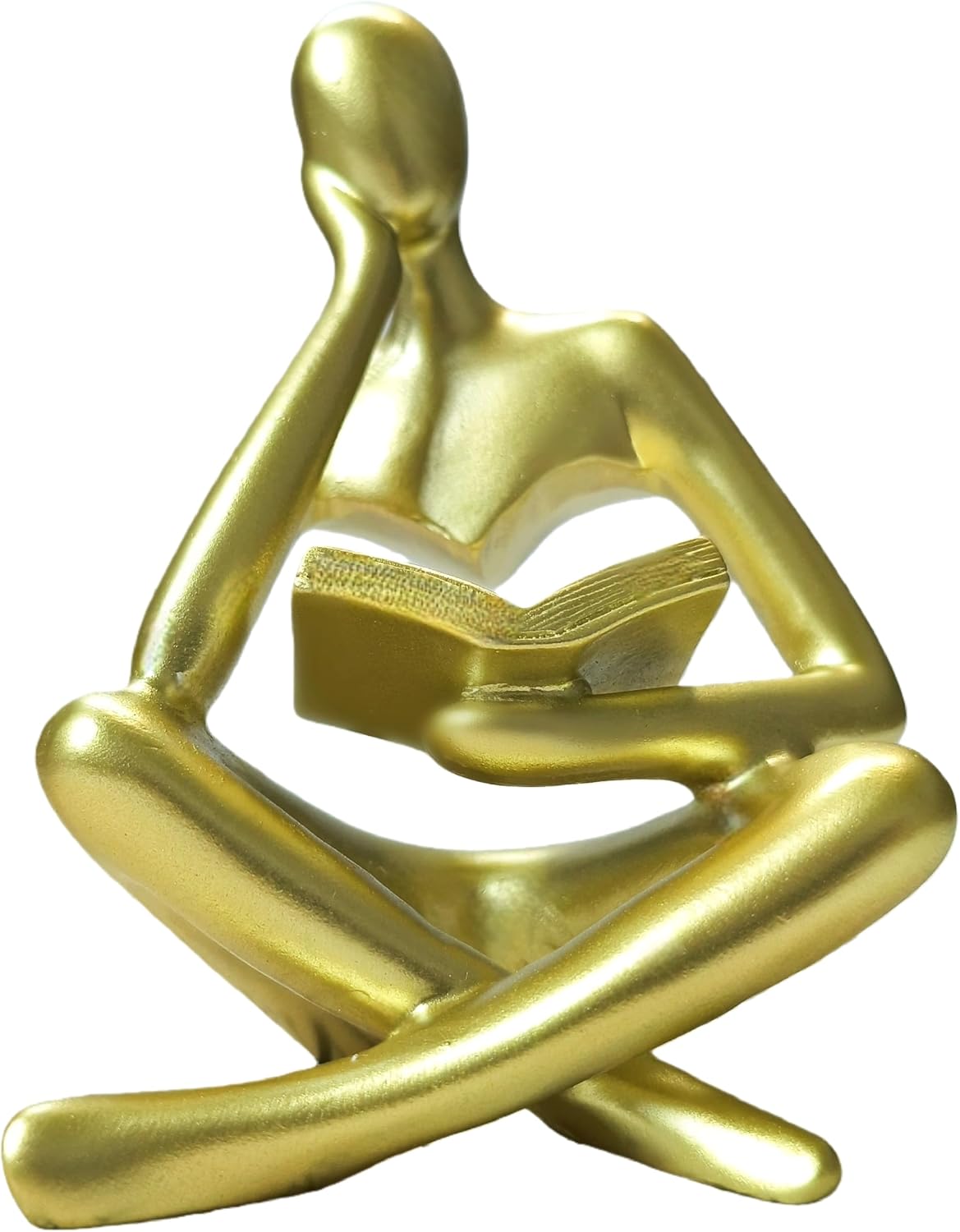
Gold Reading Woman Statue 4.5" Thinker Sculpture for Bookshelf Decor, Modern Home Accent & Book Lover Gift
Pros
- High-density resin feels solid and durable for the price
- Matte gold finish looks more expensive than its $7 price suggests
- Compact enough to fit almost anywhere without overwhelming surrounding decor
- Versatile styling works in offices, living rooms, and bedrooms
- Backed by a lifetime satisfaction guarantee with hassle-free returns
Cons
- Only 4.5 inches tall, which may look too small on larger bookshelves or mantels
- Limited to gold color with no alternative finish options currently available
- Resin material lacks the weight and coolness of ceramic or metal sculptures
There is something quietly charming about a tiny gold figure lost in a book. This reading woman statue from Goodluckstartsnow captures that feeling in a compact, well-finished piece that punches above its price point. The matte gold resin has a surprisingly refined look, especially when paired with neutral-toned books or a clean white shelf.
In a real room, it works as one of those small details guests notice and comment on. It does not demand attention, but it rewards it. Place it beside a stack of your favorite novels or tuck it into a curated shelf arrangement and it pulls the whole vignette together with a literary, personal touch.
If you want an affordable way to add personality to a bookshelf without committing to a large statement piece, this one delivers.
Styles it works with: Modern Minimalist, Glam, Transitional, Scandinavian with warm accents
Best placed in: Bookshelf among stacked books, home office desk, living room coffee table, bedroom nightstand
May not suit: Large open shelving units where the 4.5-inch height may get visually lost, or heavily rustic or industrial spaces where gold resin can feel out of place
Buy it if:
- You need a small, affordable accent to fill a gap on a bookshelf or desk
- You are putting together a gold-themed decor arrangement and want a literary focal piece
- You are shopping for a quick, thoughtful gift for a book lover, teacher, or college grad
Consider waiting if:
- You prefer a larger statement sculpture (this is only 4.5 inches tall)
Skip it if:
- You need a weighty, museum-quality figurine in metal or ceramic
- Your shelves are deep or tall and you need decor above 6 inches to be visible
Check the latest price and availability on Amazon before it sells out.
Sculptural Accent for the Triangle’s Focal Point (Lynagert Heart Hands Sculpture)
This is the piece that solves Step 3. The small heart-hands sculpture works as your mid-height focal object, the one your eye lands on when it traces the triangle. Its compact footprint fits shelves as shallow as 8 inches, and the smooth cast finish contrasts nicely against matte book spines and woven baskets. At a 4.7 rating across owner reviews, buyers consistently call out how the form reads as intentional rather than kitschy. Set it atop a short horizontal book stack from Step 2 to give it a pedestal and a few extra inches of height. It’s small enough to move around while you’re editing in Step 4, so treat it as your adjustable anchor.
The Literary Statement Piece (RHXRAFdecorforlife Abstract Thinker Statue)
If your shelf skews bookish, the abstract Thinker statue leans into that theme without feeling like a novelty. The resin construction keeps it light, so it’s safe on upper shelves where the BIFMA load math gets tighter, and the modern-art silhouette adds the sculptural height Step 3 calls for. Owners rate it 4.7 and note the matte finish photographs well and hides dust better than glossy pieces. Pair it with vertical books flush to one edge and a low stack on the other to build that 70/30 rhythm. It’s the piece that signals “someone who reads lives here” better than another frame ever could.

The Warm-Metal Accent (Goodluckstartsnow Gold Reading Woman Statue)
The gold reading-woman figurine brings the finish contrast Step 3 depends on. Most shelf objects trend matte and neutral, so one warm-metal piece introduces the reflective texture that makes a grouping feel layered instead of flat. At 4.7 stars, reviewers highlight the weighted base, which matters for stability on higher shelves. Keep it to a single gold accent per unit, since two or more start competing. Place it low-center or high-right in your triangle, and let its glint do the work of pulling the eye without adding bulk. It’s the smallest lift with the biggest payoff on a shelf that feels almost-but-not-quite finished.
Frequently Asked Questions
What if my shelves are too shallow for decor?
It depends on the depth. Under 8 inches, stick to books, slim frames, and low-profile objects like the heart-hands sculpture that fit within a 6 to 7 inch footprint. Turn a few frames sideways to lean rather than stand, and skip deep baskets or wide vases. Shallow shelves actually look cleaner with fewer, smaller objects, so lean into the constraint.
What if my bookshelf is really tall and I can’t reach the top?
Yes, tall units need a strategy. Reserve the top two shelves for lightweight, low-maintenance objects you won’t touch often, such as resin sculptures or a single tall stem. Keep books and anything you use weekly between 30 and 60 inches off the floor, your natural reach zone. Style the high shelves with larger, simpler pieces since fine detail is lost above eye level anyway.
What if my room is small and the bookcase feels overwhelming?
It depends on the wall, but negative space is your fix. In a room under about 120 square feet, aim for 40 to 50 percent empty shelf space and keep the color palette tight, two or three tones max. A busy shelf shrinks a small room; an edited one with breathing room makes it feel calmer and larger. Fewer objects, more air.
What if my shelves are all one boring color?
Yes, you can fix that without repainting. Introduce contrast through your objects instead of the shelf itself, one warm-metal piece like the gold statue, a few textured baskets, and greenery for a hit of color. A woven or matte object against a uniform laminate finish adds the depth the shelf lacks. Texture beats color when the base is monotone.
What if I don’t own enough books to fill it?
Almost never a real problem. Empty shelves are a styling opportunity, not a gap to hide. Space books out in short stacks, fill the rest with objects, baskets, and framed art, and let some shelves stay mostly open. A bookcase that’s 60 percent books and 40 percent objects looks more collected than one crammed spine-to-spine.
Bottom Line
Empty the shelf first, build a book foundation with a 70/30 vertical-to-horizontal split, then layer objects using the triangle rule and edit ruthlessly. If you take one thing from this, it’s to leave 2 to 3 inches of negative space on at least half your shelves. A single sculptural accent with real height contrast does more than five matching frames ever will. Style for the sightline from where you actually sit, not for a photo.



Write Your Review
No reviews yet. Be the first to share your experience!