

> Editorial Note: I’m Hannah Lin, an Interior Living Researcher who’s spent 9+ years analyzing the home furniture market. This guide draws on BIFMA, GREENGUARD, and FSC certifications, plus owner reviews aggregated from Wirecutter, Apartment Therapy, and the major home design subreddits.
The single most common mistake with gray floors is painting the walls the same gray, which flattens the room into a cold, dimensionless box that reads more like a parking garage than a living space. The fix starts with the floor’s undertone, not a paint chip you liked online, and it decides everything from your best gallery wall frames to your best console table for entryway, your best large floor mirror, your best wall mirror for living room, and even your best table lamp for living room. Get the undertone right and the wall color almost picks itself.
Start With the Floor’s Undertone, Not the Wall
Gray floors aren’t one color. They split into cool grays (blue, green, or violet base) and warm grays (beige, taupe, or “greige” base), and that base drives the whole palette. Here’s the quick check: lay a pure white paper towel on the floor in daylight. If the floor looks blue or steel next to the white, it’s cool. If it looks brown, tan, or slightly pink, it’s warm.
Why this matters so much. Pair a cool floor with a warm cream wall and the two fight each other, leaving the room looking muddy at the seam where wall meets floor. Match temperatures instead and the space feels intentional.
Light Reflectance Value (LRV) is your second lever. LRV runs 0 (black) to 100 (pure white), and for walls above a gray floor, most designers aim for an LRV of 55 or higher to bounce light back up and stop the floor from dragging the room dark. Apartment Therapy’s color editors repeatedly flag the same trap: dark floor plus dark wall in a north-facing room equals a cave. Keep one of the two surfaces light. Usually that’s the wall.
Best Wall Colors for Cool Gray Floors
Cool gray floors want walls that stay in the same temperature family or lean crisp and bright. Soft white with a hint of blue is the safest anchor. Look for whites in the LRV 80–85 range so the wall reads clean rather than dingy against the cooler floor below.
Want more color? Sage green, dusty blue, and pale greige all sit comfortably over a cool floor because they share that blue-green backbone. Sage in particular has stayed popular through 2026 owner threads on the home design subreddits, largely because it warms a cool room without breaking the temperature match.
Avoid true beige, buttery yellow, and terracotta here. Those warm hues clash with a blue-based floor and create that muddy seam again. If you crave warmth, add it through wood-toned furniture and textiles instead of the walls. That keeps the big surfaces harmonious while your best console table for entryway in oak or walnut delivers the cozy contrast. One accent wall in a deeper slate or navy also works, provided the other three walls stay light.
Best Wall Colors for Warm Gray Floors
Warm gray floors, the greige and taupe family, are the more forgiving base and pair with a much broader spread. Warm whites and soft creams are the obvious win. Think LRV 78–82 whites with a yellow or red drop in them, which glow against the floor rather than going flat.
Greige walls one shade lighter than the floor create a tonal, layered look that reads high-end and calm. This monochromatic move is exactly what Wirecutter’s home team recommends for renters who can’t change the flooring: match the wall to the floor’s warmth, then vary the value. Lighter wall, slightly darker floor. Simple.
For color, warm gray floors handle sage, olive, mushroom, soft terracotta, and even a muted mustard. The greige base bridges warm and cool, so you get room to play. What to skip: stark blue-white and icy gray, which turn the warm floor slightly dirty-looking by contrast. If your floor already leans brown, don’t force a cool wall on top of it. Let the warmth lead.
How to Avoid the Flat, Gray-on-Gray Room
Even with the right undertone, an all-gray room can fall flat. The rule that saves it is 60-30-10: roughly 60% dominant color (walls), 30% secondary (large furniture and floor), and 10% accent (pillows, art, lamps). Gray floors already eat a big chunk of that 30%, so your walls and accents have to carry warmth and contrast.
Contrast in value is non-negotiable. Put a light wall over a medium-gray floor, or a medium wall over a light floor, but never two surfaces at the same value. That’s the flatness people complain about.
Layer in three textures minimum. A linen sofa, a wool rug, and a wood side table break up gray’s tendency to feel synthetic. Metals help too: brass or warm bronze fixtures cut cool grays; matte black grounds warm ones. Before you commit, sample. Paint dries darker than the chip and shifts under your bulbs, so evaluate two coats on the actual wall across morning and evening light.
Helpful Picks
Sampling wall color against a gray floor at home beats guessing off a tiny chip, so the picks below focus on portable paint samplers vetted for accurate on-wall color reads and 4.0-plus owner ratings. Start with the first if you want the sturdiest reusable board.


Pros
- Generous 24-board quantity handles whole-home renovation projects without running out mid-process
- Dual-sided design with a paint-out area on the front and an identification label on the back keeps your testing process organized
- Portable format lets you physically place swatches next to rugs, countertops, or upholstery for accurate color matching
- Made in-house by FoamPRO, a brand with a long track record in professional paint tools
Cons
- Very limited review base of only 2 ratings makes it difficult to assess long-term durability or performance across different paint types
- At $64 for 24 boards, the per-unit cost is higher than DIY cardboard alternatives, which may be a sticking point for budget-focused buyers
- No mention of surface texture specifications, so buyers using specialty paints like chalk or lime wash may need to verify compatibility
Choosing the wrong paint color is one of the most expensive and frustrating mistakes you can make in a home refresh. What looks perfect on a tiny paint chip at the hardware store can read completely differently once it hits your walls under natural light. The FoamPRO 120 Sample Boards solve that problem by giving you a proper canvas to test each color at scale, right in the room where it will actually live.
What sets this pack apart from grab-and-go paint chips is the thoughtful dual-sided layout. You paint out your swatch on the front, and flip it over to find a label where you can record the brand, color name, finish, and any notes. That detail matters more than it sounds when you are juggling six shades of greige across three rooms and a week has passed since you started. The portable format is equally practical, letting you carry boards to fabric stores or tile showrooms to check how a color plays against materials you have already chosen.
If you want confident, commitment-free color testing across an entire home renovation without losing track of what you tested, this one delivers.
Styles it works with: Modern Farmhouse, Scandinavian, Transitional, Minimalist
Best placed in: Living room walls during a full repaint, bedroom accent wall planning, open-concept kitchen and dining refresh where color continuity matters across zones
May not suit: Renters or anyone not actively planning a paint project who has no immediate use for 24 boards; buyers in very small single-room spaces where only 2 or 3 boards would ever be needed at one time
Buy it if:
- You are repainting multiple rooms and need to coordinate colors across different lighting conditions and existing furnishings
- You have been burned before by a paint color that looked great in the store but wrong on your walls and want a reliable way to test before committing
- You are working with an interior designer or contractor and need a portable, organized way to share color options across multiple sites or meetings
Consider waiting if:
- You are only painting one room and a smaller or less expensive sample board option would cover your needs without the extra quantity
Skip it if:
- You are not currently planning a paint project and have no near-term use for testing swatches, as these boards have no standalone decorative value
- Your budget is tight and free paint chip cards from the hardware store are sufficient for the scale of your project
Check the latest price and availability on Amazon before it sells out.

SureSwatch Paintable Sample Film Envelopes 3-Pack | Test Paint Colors Before Committing
Pros
- Lets you move paint samples around the room to check color in different lighting conditions throughout the day
- No-mess approach keeps your walls clean during the decision-making process
- Ready to use immediately with no setup required
- 3-pack provides enough surface area to test multiple paint colors at once
Cons
- Very limited product description and no specification details make it hard to know exact film dimensions before buying
- Only 19 reviews means there is not enough real-world feedback to fully validate long-term durability
- Not useful if you have already committed to a paint color or are not actively in a redecorating project
Choosing paint colors is one of the most stressful parts of redecorating. You grab a few swatches from the hardware store, hold them up in the store lighting, and make your best guess. Then you get home, roll the color onto your wall, and watch it turn into something completely different by afternoon light. SureSwatch Paintable Sample Film Envelopes exist to solve exactly that problem.
The concept is simple and clever. Instead of painting directly onto your wall, you paint onto the film, then carry that swatch from room to room, holding it against your existing trim, furniture, and flooring. You can check the color at 8am, at noon, and under your lamp at night before you ever open a full gallon. The soft, flexible material makes this feel natural and easy rather than like a workaround.
If you want to nail your paint color on the first try without repainting over test patches on your walls, this one delivers.
Styles it works with: Modern Farmhouse, Scandinavian, Minimalist, Traditional
Best placed in: Any room you are actively repainting, including living rooms with complex natural light, bedrooms where evening lamp light changes the mood, and entryways where color needs to work with flooring and door hardware
May not suit: Homes not currently in an active painting or redecorating project, or buyers who already use large peel-and-stick paint sample cards with satisfactory results
Buy it if:
- You are planning a room repaint and have struggled to choose between two or three similar shades
- Your home has rooms with dramatically different lighting throughout the day and you need to test colors across those conditions
- You want to avoid patching over test swatches painted directly on a freshly primed wall
Consider waiting if:
- You want to confirm the exact film dimensions before purchasing, and the listing does not yet show updated specifications
Skip it if:
- You are not currently planning a paint project and have no near-term use for paint color testing
- You already rely on large-format peel-and-stick paint sample cards from your paint brand and find them sufficient
Check the latest price and availability on Amazon before it sells out.

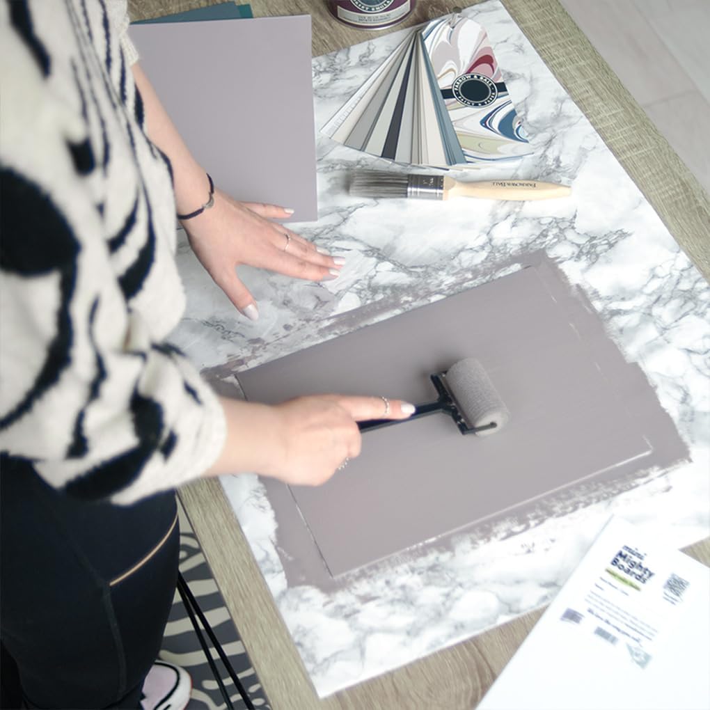
Mighty Board Minis White Polystyrene Paint Color Test Panels 12x9 Inch Set of 5 for Home Decor Projects
Pros
- Warp-free polystyrene holds its shape through multiple paint coats
- Non-absorbent surface keeps paint colors accurate and true
- Includes labels for tracking color names, brands, and room assignments
- Compatible with all paint brands, stains, and coatings
- Thin and lightweight for easy repositioning between rooms
Cons
- Only 5 panels included, which may not be enough for large projects with many color options
- 12x9-inch size may feel small when trying to visualize a full wall color
- No reviews yet to confirm long-term durability or real-world performance
Choosing paint colors is one of the most stressful parts of redecorating. You hold up tiny swatches, squint at them under different lights, and still end up second-guessing yourself after the first coat goes on the wall. These Mighty Board Minis solve that problem by giving you a proper-sized surface to test your colors on before you commit to anything permanent.
What makes these panels genuinely useful is their warp-free polystyrene construction. Unlike cardboard or foam core that buckles when wet, these stay perfectly flat. The non-absorbent surface means the paint dries exactly as it would on a primed wall, giving you an honest preview. Plus, each board has a label so you can jot down the brand and color name, which is a small detail that saves real headaches when you are jugling five or six options.
If you want to test paint colors confidently without painting directly on your walls or dealing with warped sample boards, this one delivers.
Styles it works with: Modern Farmhouse, Scandinavian, Minimalist, Traditional
Best placed in: Any room you plan to repaint, nurseries where color choices matter most, kitchens and bathrooms with tricky lighting
May not suit: Large open-concept spaces where a12x9-inch panel may look too small to judge a color accurately, or professional painters who need to test on dozens of surfaces at once
Buy it if:
- You are repainting a room and want to compare 3 to 5 colors side by side before buying a galon
- You have struggled with paint colors looking different on the wall than they did on the swatch card
- You want a reusable, portable way to test how colors look under natural and artificial light in different rooms
Consider waiting if:
- You need more than 5 panels for a whole-house color overhaul and want to buy in bulk
Skip it if:
- You have already committed to your paint color and do not need to compare options
- You prefer painting large poster-board-sized samples for a more immersive color preview
Check the latest price and availability on Amazon before it sells out.
Frequently Asked Questions
Should walls be lighter or darker than gray floors?
Almost always lighter. A wall with an LRV of 55 or higher bounces light up off the floor and keeps the room from feeling closed-in. Reserve darker walls for a single accent wall or a bright, south-facing room that can absorb the extra depth.
Do white walls work with gray floors?
Yes, but match the temperature. Cool gray floors want a blue-based white; warm greige floors want a cream or yellow-based white. A stark, mismatched white will make the floor look dirty by comparison, which is the opposite of the clean look you’re after.
What’s the best accent color for gray floors and walls?
It depends on the floor’s undertone. Cool floors love sage, navy, and dusty blue. Warm floors take terracotta, mustard, and olive. Keep the accent to roughly 10% of the room, following the 60-30-10 rule, so it pops instead of competing.
Can I use beige walls with gray floors?
Yes, if the floor is a warm greige. Beige over a warm floor reads as a soft, layered neutral. Over a cool blue-gray floor, though, beige clashes and muddies the seam where wall meets floor, so skip it there.
Are gray floors going out of style in 2026?
No. Warm gray and greige floors are still strong in owner threads and design coverage, though the icy blue-grays popular five years ago have cooled off. If your floor leans warm, you’re squarely in current territory.
How do I warm up a room with gray floors?
It depends on where you add it. Wood-toned furniture, brass fixtures, linen and wool textiles, and a cream or greige wall all inject warmth. Layer at least three textures so the gray doesn’t read as cold or synthetic.
Does lighting change how wall color looks over gray floors?
Yes, dramatically. Cool LED bulbs (4000K+) push a gray room colder and can gray-out a warm wall; warm bulbs (2700K) do the reverse. Evaluate your paint samples under your actual bulbs, morning and night, before committing.





Write Your Review
No reviews yet. Be the first to share your experience!