

> Editorial Note: I’m Hannah Lin, an Interior Living Researcher who’s spent 9+ years analyzing the home furniture market. This guide draws on BIFMA, GREENGUARD, and FSC certifications, plus owner reviews aggregated from Wirecutter, Apartment Therapy, and the major home design subreddits.
The single most common wall art mistake is scale: people buy a piece that’s too small for the wall, then hang it too high, and the whole room reads unfinished. Get the size and height right and even a $40 canvas looks intentional. Before you start, it helps to think about the wall as part of a system that also includes your best gallery wall frames, your best console table for entryway, a best large floor mirror, a best wall mirror for living room, and a best table lamp for living room, since art rarely lives alone on a blank wall.
How Big Should the Art Be for the Wall?
Size is where most rooms go wrong, so start here. The reliable rule: art should fill roughly two-thirds to three-quarters of the wall or furniture it sits above. Over a standard 84-inch sofa, that means a piece or grouping about 56 to 63 inches wide. Anything narrower than half the sofa looks like an afterthought.
For a single statement piece on an empty wall, measure the wall width and multiply by 0.6. A 10-foot wall (120 inches) wants art around 72 inches wide, whether that’s one oversized canvas or a tight cluster read as a single block. Apartment Therapy’s editors make the same point repeatedly: undersizing is the number one reason a wall feels off.
Height matters just as much as width. Vertical art suits narrow walls between windows or beside a doorway; horizontal art suits the space above long, low furniture. If you’re torn between two sizes, go bigger. A too-large piece feels bold. A too-small one just looks lost. That’s the whole trade-off.
Where Should You Hang It?
Center the art at 57 to 60 inches from the floor to the middle of the piece. That’s standard gallery height, and it’s calibrated to average eye level. Most people hang 6 to 12 inches too high, which breaks the visual connection between the art and the furniture below it.
When art sits above a sofa, console, or headboard, ignore the eye-level rule and anchor to the furniture instead. Leave 6 to 8 inches of gap between the top of the sofa back and the bottom of the frame. Any more and the art floats; any less and it feels cramped.
For a gallery wall, treat the whole arrangement as one shape. Find the center of that combined shape, then hang so it lands at that 57-to-60-inch mark. Keep 2 to 3 inches of consistent spacing between frames. Lay the whole layout on the floor first and adjust there, because holes in drywall are a lot harder to move than paper templates. Painter’s tape outlines on the wall save real frustration.
What Material and Finish Hold Up Best?
Material affects both look and longevity, and the differences are real. Canvas gives you texture and depth, reads casual, and skips glass glare, which makes it forgiving in bright rooms. Framed paper prints under glass or acrylic look crisper and more formal, but glass adds glare and weight. Metal prints resist humidity, so they’re the smart pick for a bathroom or a kitchen backsplash zone.
Watch for off-gassing on cheap prints. Pieces certified to GREENGUARD standards limit VOC emissions, which matters in a bedroom where you sleep eight hours a night. Solid wood frames carrying an FSC label come from responsibly managed forests and tend to warp less than thin composite frames in humid climates.
Owner reviews on Wirecutter and the home design subreddits flag the same failure points: flimsy sawtooth hangers that bend, canvas that sags on a weak stretcher bar, and colors that fade in direct sun within a year. Look for kiln-dried stretcher bars at least 1.5 inches deep and UV-resistant inks if the wall gets afternoon light. A 4.5-plus owner rating usually signals the frame and hardware are worth the money.
How Do You Match Art to Your Room’s Style?
Let the room lead, then pick art that echoes one thing already in it. Pull a color from your rug, a throw, or the wood tone of your furniture, and repeat it in the art. That single repeated note is what makes a piece feel chosen rather than random.
For a neutral, layered room, abstract or minimalist pieces in muted tones add interest without competing. For a warmer, cottage-leaning space, vintage florals and botanical prints bring softness. Bold, colorful abstracts work best as the room’s one loud element, so pair them with quiet furniture and let the art do the talking. Don’t stack two statement pieces on facing walls.
Think about mood too. Landscapes and soft abstracts calm a bedroom; energetic color suits a living room or home office. Match the frame finish to your metals and wood: warm oak frames with warm rooms, black or brushed frames with cooler, modern spaces. Keep it simple. One repeated color, one consistent frame family, and the wall pulls together on its own.
Helpful Picks
These three cleared a 4.2-plus owner rating and cover the styles most rooms need: a hand-painted minimalist canvas, a framed vintage floral, and a colorful modern abstract. Start with the one that echoes a color already in your room.


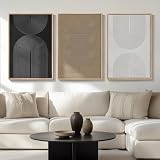
THRLVEART Hand-Painted Abstract Canvas Wall Art 40x20 Inch 3D Textured Minimalist White Decor for Living Room Bedroom Kitchen
Pros
- Genuinely hand-painted with visible brushstroke texture you can feel
- Ready to hang out of the box with no framing required
- Versatile minimalist style fits modern, Scandinavian, and transitional rooms
- Wide 40x20 format works well as a statement piece above furniture
- Solid 4.6-star rating indicates consistent buyer satisfaction
Cons
- May have a mild paint odor for 1-2 days after unboxing due to sealed packaging
- Each piece varies slightly from product photos since it is hand-painted
- Limited to one size option, so it may not work for smaller wall spaces
There is something immediately different about hanging an actual hand-painted canvas versus a mass-produced print. This THRLVEART piece has real, tactile brushstrokes you can see and feel, and the3D texture catches light in a way that flat prints simply cannot. The neutral white and cream palette keeps things calm and sophisticated without competing with your furniture or accent colors.
At 40 by 20 inches, it fills that awkward horizontal space above a sofa or headboard perfectly. It arrives stretched on a solid wood frame, so hanging takes about two minutes. No trips to the framing shop, no extra cost, no hassle.
If you want the look and feel of original gallery art without spending hundreds, this one delivers.
Styles it works with: Minimalist, Scandinavian, Modern Coastal, Transitional
Best placed in: Above the sofa in a living room, over the headboard in a bedroom, along a kitchen or dining room accent wall
May not suit: Very small rooms where a 40-inch-wide piece would overwhelm the wall, or heavily traditional ornate decor schemes where abstract art feels out of place
Buy it if:
- You want original hand-painted art without paying gallery prices
- You need a wide horizontal piece to fill space above a sofa, bed, or console
- You prefer textured, tactile wall decor over flat canvas prints
Consider waiting if:
- You need a specific color palette beyond white and neutral tones
- You want to see more reviews accumulate before committing
Skip it if:
- You need a smaller piece for a narrow or compact wall
- You are sensitive to paint odors and cannot ventilate the room for a day or two after unboxing
Check the latest price and availability on Amazon before it sells out.

Cuspin Large Framed Vintage Floral Canvas Wall Art 30x60 Inch Neutral Wildflower Farmhouse Living Room Decor
Pros
- Genuinely large statement piece that fills big walls without needing multiple frames
- Solid wood frame included at price point where many competitors use lightweight MDF
- Neutral color palette is versatile enough to work with seasonal decor changes
- Canvas has water-resistant and fade-resistant coating for long-term durability
- Hanging hardware included in the box for quick setup
Cons
- Hooks are not pre-installed on the frame, requiring you to measure and attach them yourself
- Actual dimensions (57x28.5 inches) differ from the30x60 listed in the title, which may cause confusion
- No verified customer reviews yet to confirm real-world color accuracy or build quality
This is the kind of piece that anchors an entire room without trying too hard. The wildflower composition in soft beige, cream, and muted orange tones feels like something you would find in a curated home decor shop, not a mass-produced print. At nearly five feet wide, it fills that frustrating blank wall above a sofa or bed in one clean move.
What stands out is the solid wood frame at this price point. Many oversized canvas prints in this range come with flimsy frames that warp over time, but the wood construction here adds genuine weight and a finished look. The matte canvas finish avoids that cheap glossy sheen and keeps the painterly quality intact.
If you want a single oversized art piece that brings warmth to a neutral room without the cost of custom framing, this one delivers.
Styles it works with: Modern Farmhouse, Cottagecore, Neutral Minimalist, Soft Traditional
Best placed in: Above a living room sofa, over a king or queen bed headboard, centered on a large dining room wall
May not suit: Small rooms or apartments where a 57-inch-wide piece would overwhelm the wall space, or bold maximalist interiors where the muted palette may feel too subdued
Buy it if:
- You have a large blank wall (at least 6 feet wide) that needs a single statement piece
- Your room already features neutral or earthy tones and you want art that harmonizes rather than pops
- You prefer a framed, ready-to-hang solution over piecing together a gallery wall
Consider waiting if:
- You want to see verified buyer photos first since this product currently has no customer reviews
- You are between sizes and want to confirm the 57x28.5 inch framed dimensions will fit your wall
Skip it if:
- You need bold, saturated colors to complement a vibrant or jewel-toned room
- Your wall space is under 5 feet wide, as this piece will look cramped without breathing room on either side
Check the latest price and availability on Amazon before it sells out.

Pros
- Large 40x40 square size fills big empty walls without neding multiple pieces
- Solid wood frame included so no extra framing expense
- Canvas is water-resistant and dust-proof for easy maintenance
- Vivid color saturation with orange, blue, red, and gold tones
- Arrives ready to hang with minimal setup
Cons
- Zero customer reviews yet so long-term durability is unverified
- Only one size option available so it may overwhelm smaller rooms
- Abstract style with bold splashes may clash with traditional or muted decor
This Cuspin abstract canvas print does one thing really well: it fills a big, blank wall with confident color. The 40x40-inch square format is genuinely oversized, which means you get gallery-level impact from a single piece rather than fussing with arrangements of smaller frames. The orange-and-blue palette is energetic without being chaotic, and the black wood frame gives it a polished, intentional look.
In a real room, this reads as the kind of art someone chose on purpose. It pairs naturally with neutral furniture and warm wood tones, and the layered paint-splash texture keeps things interesting up close. The water-resistant canvas is a practical bonus if you plan to hang it in a dining area or hallway where dust and humidity are common.
If you want a single bold art piece that transforms a bare wall without the hassle of custom framing or gallery wall planning, this one delivers.
Styles it works with: Contemporary, Mid-Century Modern, Eclectic, Maximalist
Best placed in: Living room feature wall above a sofa, dining room accent wall, large hallway or entryway with high ceilings
May not suit: Small rooms under 120 sq ft where a40-inch piece may feel overwhelming, or homes with a strictly traditional or farmhouse aesthetic where bold abstract splashes could feel out of place
Buy it if:
- You have a large empty wall (at least 6 feet wide) that needs a single statement piece
- You prefer ready-to-hang art and want to skip trips to a frame shop
- Your room features neutral tones and needs a pop of warm, energetic color
Consider waiting if:
- You want to see real customer photos and reviews before committing to an unreviewed product
- You need a different size option to fit a smaller or narrower wall space
Skip it if:
- Your decor leans traditional, rustic, or minimalist with muted palettes
- You need art smaller than 30 inches to fit a compact room or gallery grouping
Check the latest price and availability on Amazon before it sells out.
Frequently Asked Questions
How high should I hang wall art above a sofa?
Yes, there’s a specific number: leave 6 to 8 inches between the top of the sofa back and the bottom of the frame. This keeps the art visually anchored to the furniture instead of floating. Skip the standard 57-inch eye-level rule here, because the sofa becomes your reference point.
Is one large piece better than a gallery wall?
It depends on the wall and your patience. One large piece is faster, cleaner, and harder to get wrong, so it’s the safer choice for beginners. A gallery wall adds personality and flexibility but demands careful spacing and layout planning. If you’re unsure, start with a single oversized canvas.

Can I hang canvas art in a bathroom?
Almost never a good idea unless the room is well ventilated. Bathroom humidity warps stretcher bars and can spot the canvas over time. Metal prints or framed pieces under acrylic hold up far better in steamy rooms. If you love a canvas look, keep it away from the shower zone.
Does the frame color need to match my furniture?
No, but it should relate to your metals and wood tones. Warm oak or gold frames suit warm, layered rooms; black and brushed-metal frames suit cooler, modern spaces. Matching is optional. Coordinating is what actually makes the wall feel considered.
How do I choose art size for a blank wall?
It depends on the wall width, and there’s a formula. Measure the wall and multiply by 0.6 to get your target art width. A 10-foot wall wants art around 72 inches wide, as one piece or a tightly grouped cluster. When torn between sizes, size up.
Should art be centered on the wall or the furniture?
It depends on what’s below it. Over a sofa or console, center the art on the furniture, not the wall, so the two read as a pair. On an empty wall, center it horizontally and hang it at 57 to 60 inches to the middle. Furniture always wins as the anchor.
Is expensive wall art worth it over budget prints?
No, not for most rooms. A well-sized $40 canvas hung correctly beats a pricey piece that’s too small or too high. Spend on scale and quality hardware first: kiln-dried stretcher bars, sturdy hangers, and UV-resistant inks. The price tag matters far less than the fit.



Write Your Review
No reviews yet. Be the first to share your experience!