

> Editorial Note: I’m Hannah Lin, an Interior Living Researcher who’s spent 9+ years analyzing the home furniture market. This guide draws on BIFMA, GREENGUARD, and FSC certifications, plus owner reviews aggregated from Wirecutter, Apartment Therapy, and the major home design subreddits.
Most wall art goes wrong before the first nail goes in: people center the piece on the wall instead of centering it on the furniture, sightline, or room zone it serves. That’s why a nice print can look stranded above a sofa, and why a gallery wall can feel noisy even when every frame is beautiful. Treat wall art like furniture planning, not decoration afterthought. If you’re building a whole living room, pair this layout work with best area rug for living room, best coffee table for sectional, best accent chair for living room, best tv stand for 75 inch tv, and best sofa table so the wall, floor, seating, and storage all speak the same scale language.
The Ground Rules Before You Start
Start with the anchor piece, not the empty wall. Over a sofa, console, bed, or dining bench, the art grouping should usually span 60% to 75% of the furniture width, with the bottom edge 6 to 10 inches above the furniture. For standalone art, keep the center of the piece around 57 to 60 inches from the floor, which is the museum-standard sightline Apartment Therapy often references for residential hanging. Leave at least 3 inches between frame edges in a gallery wall. Tight enough to read as one idea. Loose enough to breathe.
Step 1: Choose the Anchor Wall First
Pick the wall that already has a job. That’s usually the wall behind the sofa, above a console, beside the dining table, or opposite the main entry view. Don’t start with the largest blank space just because it’s empty; start where the room naturally pauses. In a living room, the first visible wall from the doorway often matters more than the long side wall no one faces while seated.
Measure the furniture below the art before you shop or hang. A 90-inch sofa wants an art arrangement roughly 54 to 68 inches wide. A 60-inch console can handle 36 to 45 inches of framed width. If you’re hanging one large canvas, that measurement is easy. For a set of frames, add the frame widths plus the gaps between them.
Here’s the coach rule: the furniture owns the art. Not the wall. If the art floats far past the sofa arms or shrinks to half the console width, the room reads off-balance no matter how expensive the print looks.
Step 2: Set the Height Before You Set the Style
Height fixes more rooms than color does. For a standalone frame, mark the center point at 57 to 60 inches from the floor, then work backward from the frame height to place the hanger. For art over furniture, ignore that sightline rule if it pushes the piece too high. The bottom edge should usually sit 6 to 10 inches above the sofa back, headboard, mantel, or console top.
Use painter’s tape before hardware. Tape the full outside dimensions on the wall and sit where you normally sit. If the taped shape feels like it’s hovering, lower it 2 inches. If it feels cramped against a lamp, sconce, or tall vase, raise it 1 inch or reduce the art size.
Wirecutter’s framing coverage often emphasizes hardware weight ratings, and that matters here. A 16×20 frame with glass can weigh several pounds. Use wall anchors rated above the actual frame weight, especially on drywall. Pretty isn’t enough. Secure wins.
Step 3: Build a Gallery Wall From the Middle Out
A gallery wall works when it has one visual center. Choose the largest frame or strongest image as the anchor, then build outward in a rough rectangle. Keep the overall center at 57 to 60 inches high, and keep gaps consistent at 2 to 3 inches. Random spacing is what makes gallery walls look chaotic, not the mix of frame sizes.
Lay everything on the floor first. Start with the biggest piece slightly off-center, then place medium frames around it before adding small frames. A strong gallery wall usually has 1 large piece, 2 to 4 medium pieces, and several smaller accents. If every frame is the same size, the wall can look stiff; if every frame is different, it can look like a thrift pile.
Repeat one thing. Same frame color, same mat color, same subject family, or same finish. FSC-certified wood frames can help if you’re trying to keep the material story consistent, while black metal frames create a sharper line against white or warm beige walls.
Step 4: Match the Art Width to the Room Zone
Open-concept rooms need zones. Wall art can do that job without adding another piece of furniture. Over a reading chair, a single 18×24 or 24×36 piece is usually enough. Over a sectional, a 48-inch-wide canvas or a 5-frame arrangement may work better because the seating zone is wider. Over a sofa table, keep the art narrower than the table by at least 6 inches on each side.
Think in rectangles, even if the pieces aren’t rectangular. A round mirror, two vertical prints, and one small frame still create an imaginary outer shape. That outer shape should line up with the furniture zone below it. BIFMA standards focus on furniture safety and durability rather than art placement, but the principle transfers: stable rooms come from load, clearance, and proportion working together.
Leave breathing room near corners. Keep art at least 8 to 12 inches from a room corner, curtain panel, or tall bookcase. Crowded edges make the wall feel smaller. Clean margins make the room feel planned.
Step 5: Balance Color, Matting, and Negative Space
Once the size and height are right, choose the visual weight. Dark frames feel heavier than pale wood. Thick mats make small photos feel more intentional. Frameless canvas reads softer, while glass-front frames read cleaner and more formal. None of this works if the wall is packed edge to edge.
Use a 70/30 rule for color. Let 70% of the arrangement stay quiet through white mats, wood, black, beige, or one repeated metal finish. Let 30% carry color, pattern, or high-contrast photography. That keeps the wall from fighting the rug, pillows, and coffee table objects already in the room.
Negative space is part of the arrangement. A 36-inch blank stretch beside a gallery wall can make the gallery look sharper, not unfinished. Stop before the wall feels full. That’s the move.
The Right Products Make It Easier
The three options below were selected for real layout jobs: multi-size frame sets, owner ratings above 4.0, and formats that make spacing easier for first-time gallery walls. Start with Vittanly if you want one large collage plan, CamdenReed if you need fewer bigger frames, and SheffieldHome if a small natural-wood grouping fits the room better.

Vittanly 15-Pack Picture Frame Set - Multi Size Gallery Wall Collage (8x10, 5x7, 4x6) Walnut Brown
Pros
- Versatile mix of three standard photo sizes covers most common print dimensions
- Dual mounting options with built-in stand and wall hooks for flexible placement
- Scratch-resistant MDF construction holds up well to handling during rearrangement
- Includes all hanging hardware so no extra trip to the store is needed
- Matte finish resists fingerprints and reduces glare in bright rooms
Cons
- Plexiglass can attract static and dust more than real glass
- Walnut brown is the only color option, limiting use in cool-toned or all-white rooms
- Lightweight enginered wood may feel less premium than solid wood frames
Gallery walls look incredible design magazines, but pulling one together yourself usually means buying frames one by one, hoping the finishes match, and spending way more than planned. This Vittanly set solves all of that in a single box. Fifteen frames, three sizes, one consistent walnut brown finish that looks warm and intentional on any wall.
In a real room, the matte enginered wood reads clean and modern without feeling cheap. The plexiglass front keeps things lightweight and safe, which matters when you are hanging15 frames above a sofa or in a hallway. The mix of 8x10, 5x7, and 4x6 covers everything from a wedding portrait to a vacation snapshot to a kid's art print.
If you want a polished gallery wall without spending hours sourcing matching frames or worying about breakage, this one delivers.
Styles it works with: Modern Farmhouse, Transitional, Mid-Century Modern, Warm Minimalist
Best placed in: Living room accent wall, staircase gallery, hallway or entryway display, bedroom above dreser
May not suit: Rooms with an all-white or very cool-toned palette where walnut brown may clash, or very small spaces where 15 frames could overwhelm the wall
Buy it if:
- You want to create a full gallery wall in one purchase without mismatched finishes
- You have kids or pets and need shatterproof frames instead of glass
- You like rearranging decor seasonally and want frames that work on walls and shelves
Consider waiting if:
- You need a color other than walnut brown to match your existing decor
- You prefer real glass fronts for a higher-end look and sharper clarity
Skip it if:
- You only need one or two frames and do not want extras sitting in a closet
- You require larger sizes like 11x14 or 16x20 as your primary display
Check the latest price and availability on Amazon before it sells out.

Camden Reed 5-Piece Mixed Gallery Wall Frame Set - Black/Gold with Oval Frame, Includes Hanging Template
Pros
- Includes a unique oval frame that adds variety to your gallery wall
- Wall hanging template with multiple layout options saves time and frustration
- Mix of frame sizes accommodates different photo and art print dimensions
- Black and gold color combination works across many decor styles
- Frames can be hung horizontally or vertically for flexible arrangements
Cons
- Limited to black/gold color option, which may not suit all room palettes
- Only 26 reviews so far, making long-term durability harder to confirm
- At roughly $21 per frame, it is not the cheapest option for basic gallery walls
Gallery walls look efortless on social media, but anyone who has tried to assemble one from mismatched frames knows the reality. This Camden Reed set solves that problem by giving you five frames that already coordinate, including an oval that keeps things from looking too rigid or predictable.
The black and gold finish hits sweet spot between statement and subtlety. It reads upscale without overwhelming the photos or art inside, and the gold accents catch light in a way that gives the whole arrangement a polished, intentional look.
If you want a put-together gallery wall without hunting for matching frames at five different stores, this one delivers.
Styles it works with: Transitional, Modern Glam, Contemporary Classic, Art Deco-inspired
Best placed in: Living room feature wall, hallway or staircase wall, bedroom above a dreser or headboard
May not suit: Ultra-minimalist or all-white Scandinavian rooms where gold accents feel out of place, or very small walls where five frames would feel crowded
Buy it if:
- You want a complete gallery wall set that looks coordinated right out of the box
- You prefer a mix of frame shapes and sizes over a uniform grid layout
- You value the included hanging template to avoid putting unnecessary holes in your wall
Consider waiting if:
- You need a different color finish to match your existing decor
- You want to see more customer reviews before committing to a newer product
Skip it if:
- You only need one or two frames rather than a full gallery set
- You prefer a modern frameless or floating frame aesthetic over traditional mated frames
Check the latest price and availability on Amazon before it sells out.
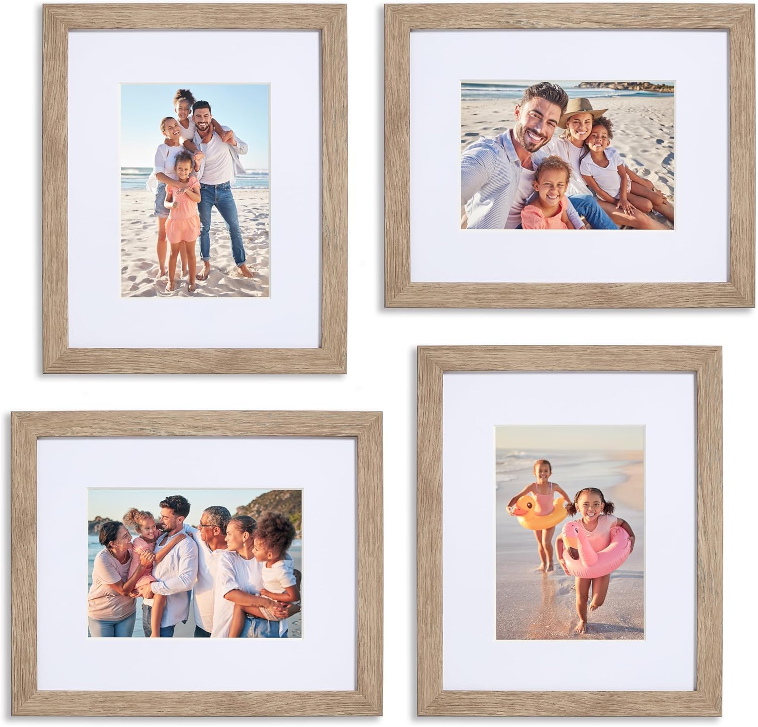
Sheffield Home 4 Piece Gallery Wall Frame Set 8x10 Inch Light Natural Wood Finish with Hanging Template
Pros
- Hanging template eliminates guesswork and speeds up installation
- Protective mats give photos a professional, gallery-quality presentation
- Light natural wood tone works across modern, farmhouse, and boho interiors
- Securely packaged with drop-test protection so frames arrive intact
- Versatile 8x10 size fits standard photo prints without custom cropping
Cons
- Polystyrene construction feels lighter and less premium than solid wood frames
- Only available in one color per set, limiting mixed-finish gallery walls
- 8x10 is the only size in this set, so you cannot create varied dimension layouts
Gallery walls can feel intimidating, but this Sheffield Home set takes the planning out of the equation. The included wall template lets you tape up your layout, hang the frames, and pull the template away. No pencil marks, no measuring tape, no YouTube tutorials required. It is genuinely one of the simplest ways to go from blank wall to finished gallery in under20 minutes.
The light natural finish has a warm, airy quality that works whether your space leans modern, coastal, or farmhouse. The protective glass and mats give even casual snapshots a polished, intentional look. And because the frames are lightweight polystyrene, you can rearrange without worrying about heavy hardware or wall damage.
If you want a pulled-together gallery wall without spending an entire weekend on layout and leveling, this one delivers.
Styles it works with: Modern Farmhouse, Coastal, Scandinavian, Transitional
Best placed in: Living room accent wall, hallway gallery arrangement, bedroom above dreser or headboard
May not suit: Ultra-maximalist or dark mody interiors where a bolder frame color would stand out better, or large open walls that need more than four frames to fill the space
Buy it if:
- You have been staring at a blank wall for months and want a quick, cohesive solution
- You are a renter who needs lightweight frames with minimal wall damage
- You prefer a neutral, natural wood look that will not clash when you redecorate
Consider waiting if:
- You need a darker finish like walnut or black to match existing frames in your home
- You want a mixed-size gallery set with different frame dimensions for visual variety
Skip it if:
- You need heavy-duty solid wood frames for oversized prints or professional art display
- You want frames larger than 8x10 to fill a big accent wall above a sofa
Check the latest price and availability on Amazon before it sells out.
Vittanly is the practical pick for Step 3 because the 15-piece mix gives you enough scale variety to build from the middle out. The set includes 8×10, 5×7, and 4×6 frame sizes, which means you can create one larger gallery wall instead of scattering tiny frames across a sofa wall. Its 4.7 owner rating is strong for a collage set, and the quantity helps if you’re filling a 60- to 72-inch visual span. Use the largest frames first, then treat the smallest ones as rhythm, not filler.
CamdenReed fits Step 2 and Step 4 better if you want a cleaner, less crowded arrangement. The set’s larger 16×20, 11×14, and 8×10 sizes can cover a console wall or sofa zone with fewer holes and wider breathing room. A 5-piece set also helps renters because you’re not committing to 15 separate placements. With a 4.4 owner rating, it’s the better direction when the room already has patterned upholstery, a textured rug, or a busy media wall nearby.
SheffieldHome works best for Step 5, especially in rooms with oak floors, linen upholstery, rattan, or warm neutral paint. The 4-piece 8×10 format won’t fill a long sectional wall by itself, but it’s right for a 30- to 40-inch zone above a small table, reading nook, or narrow hallway. Its light natural finish softens the grid, while the 4.4 owner rating keeps it in the reliable range. Use this set when you want the art to support the room instead of taking over.
Frequently Asked Questions
What if my sofa is much wider than my art?
Go wider or group pieces. A single 24×36 frame over a 96-inch sofa will look underfed unless it’s paired with sconces, shelves, or companion frames. Aim for art that spans 60% to 75% of the sofa width, so that 96-inch sofa wants roughly 58 to 72 inches of total visual width.
What if my ceilings are only 8 feet high?
Keep the art lower, not smaller by default. Center standalone pieces around 57 inches from the floor, and keep art over furniture 6 to 8 inches above the top edge. Tall ceilings can handle extra vertical drama; 8-foot rooms usually look better with wider arrangements and calmer spacing.
What if my room has no obvious focal wall?
Create one with the seating direction. Stand at the main doorway and note where your eye lands first, then check where people face when seated. If those are different walls, prioritize the seated view. A 36- to 48-inch piece above a console can create a focal point without competing with the TV.
What if I rent and can’t make many holes?
Use fewer, larger pieces. A 5-frame set usually gives more impact with less hardware than a 12-piece collage. Keep each frame under the adhesive strip’s posted weight limit, and measure the full arrangement with tape first. For heavy glass frames over 5 pounds, ask before relying on removable strips.
What if my gallery wall looks crooked even when measured?
Check the gaps, not just the level. A frame can be level and still look wrong if the spacing changes from 2 inches to 5 inches across the wall. Rebuild the layout around one center piece, keep gaps within a 1-inch range, and align at least one vertical or horizontal edge.
Bottom Line
The rule that matters most is simple: arrange wall art around the furniture zone, not the empty wall. Once the width hits 60% to 75% of the anchor piece and the bottom edge sits 6 to 10 inches above furniture, style choices get easier. The main exception is a hallway or entry wall with no furniture below it; there, use the 57- to 60-inch centerline and let traffic clearance guide the layout. Measure first, then decorate.









Write Your Review
No reviews yet. Be the first to share your experience!